Tikka Taco | visual identity for a restaurant
Brand identity
Industry
Food
Discipline
Visual identity
Location
USA
Year
2020
overview
This project is the result to integrate Mexican and Indian culture into a modern visual identity through the study of forms, concepts And linking the different ideas between the two cultures in a simple, fresh, and popular template. In the middle of my work routine, I decided to pause and produce something free and creative to return more "balance" to my other projects.
Brief
Tikka Taco is an Indian restaurant that is launching a new brand targeted at a big audience from Young people and teenagers, and everyone who carries a western modern culture .sell tacos that are flavored with Indian cuisine with a little kick. Reflects for something popular, smart, fun, and easy to understand.

I set out to explore commonality between the Mexican and Indian cultures. there are many things in common, such as the variety use of spices and the variety in the dishes, but i focused on the extent of the popularity of restaurants or other food places is on both sides, the spirit that distinguish "street food". to reduce the differences between the two sides, i decide to add a modern Western touch to the visual identity.

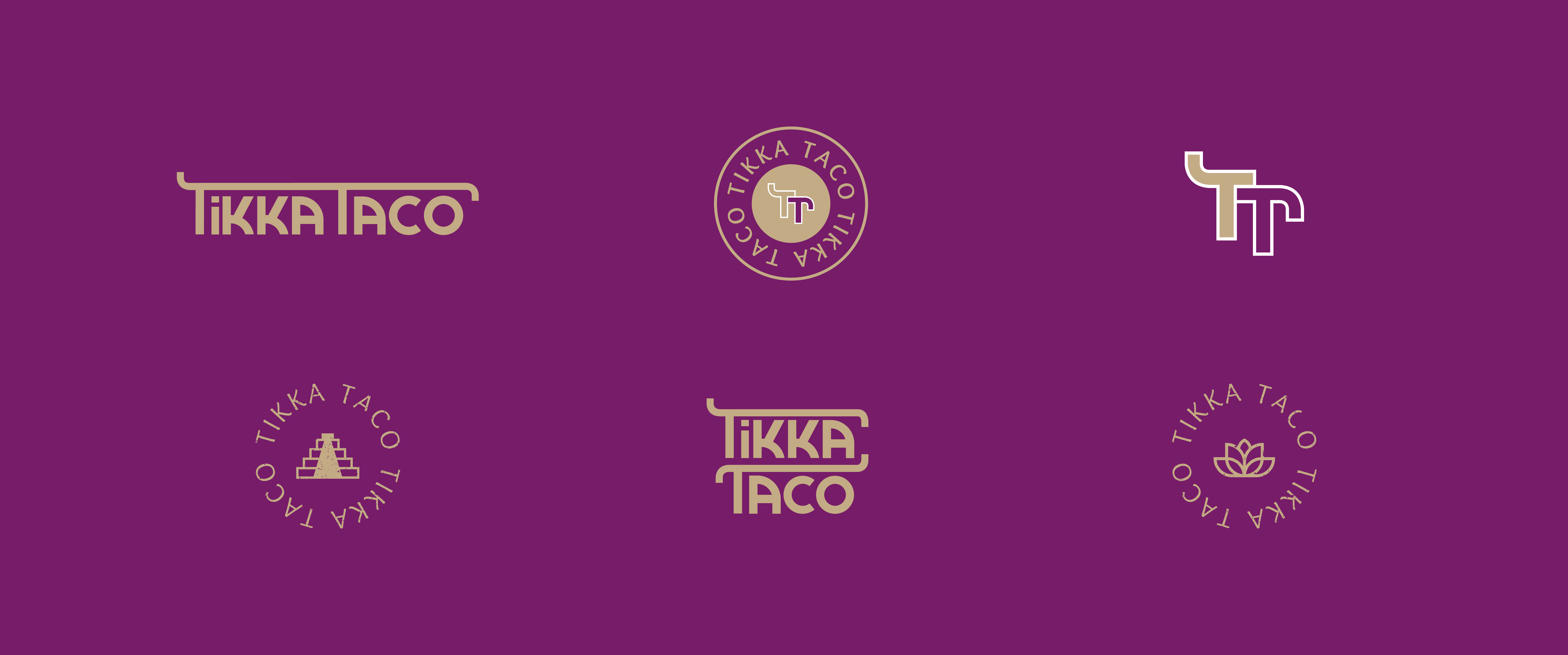
After studying the Hindi letters, i explored that most letters are have a vertical line on the top, and i used this idea to our advantage by making it more bold and popular, which is also what distinguishes Mexican typography.
