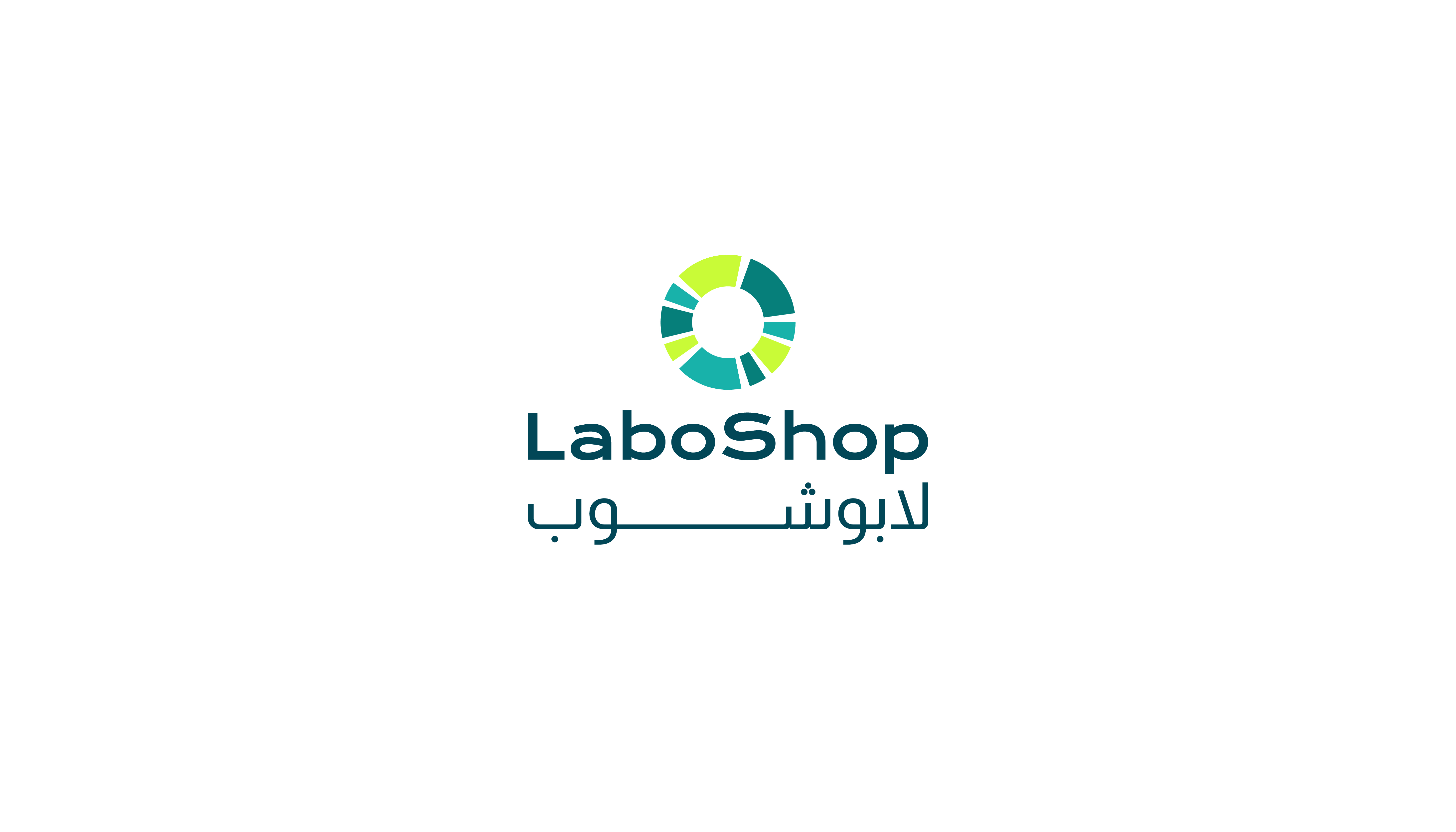
Laboshop
Brand identity
Industry
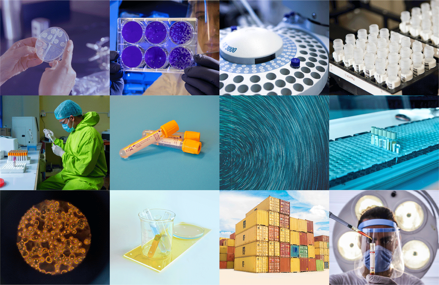
Molecular biology - E commerce
Discipline
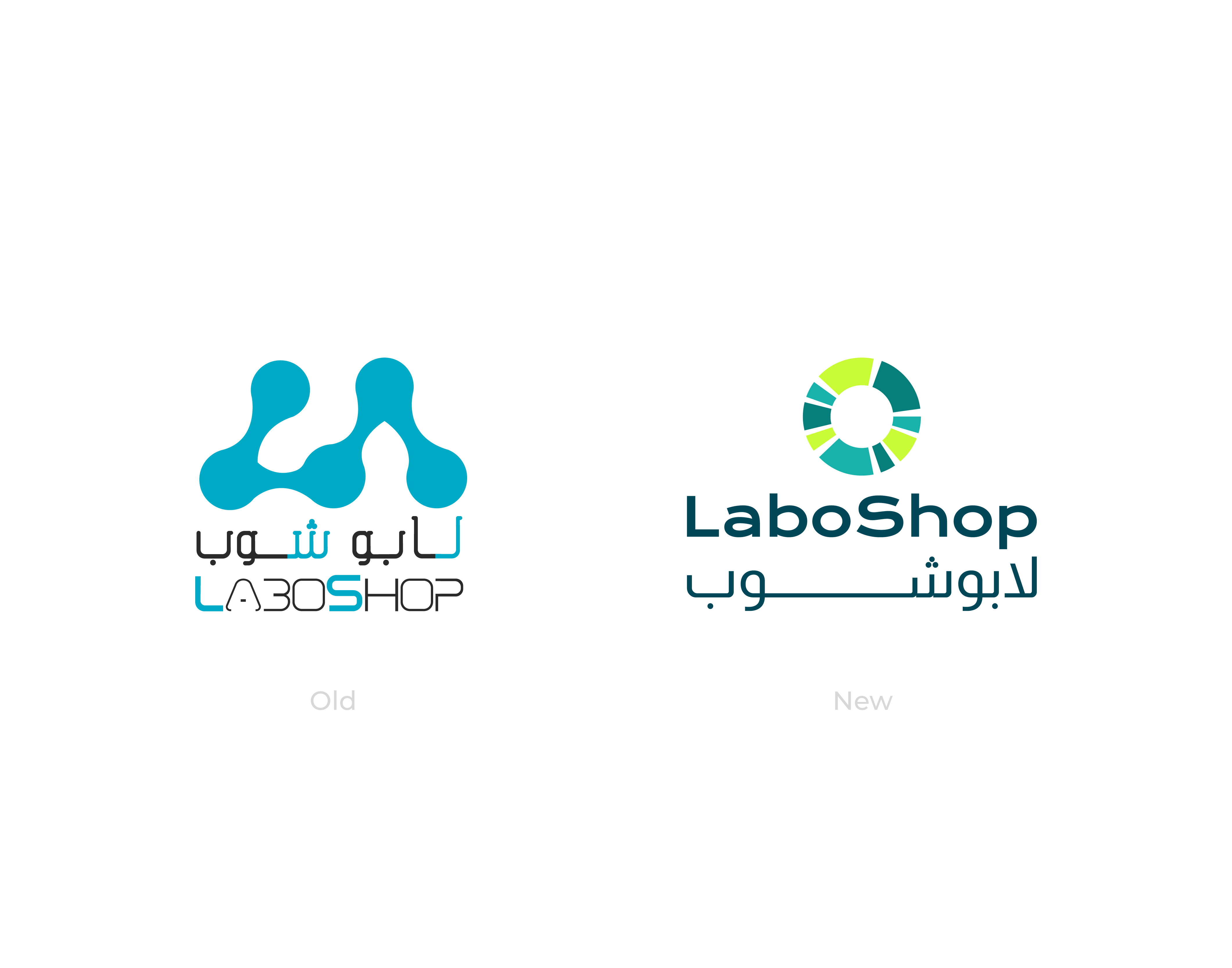
Rebranding
Location
Dubai - UAE
Year
2021
Overview
This project comes from the previous project MEMBS.
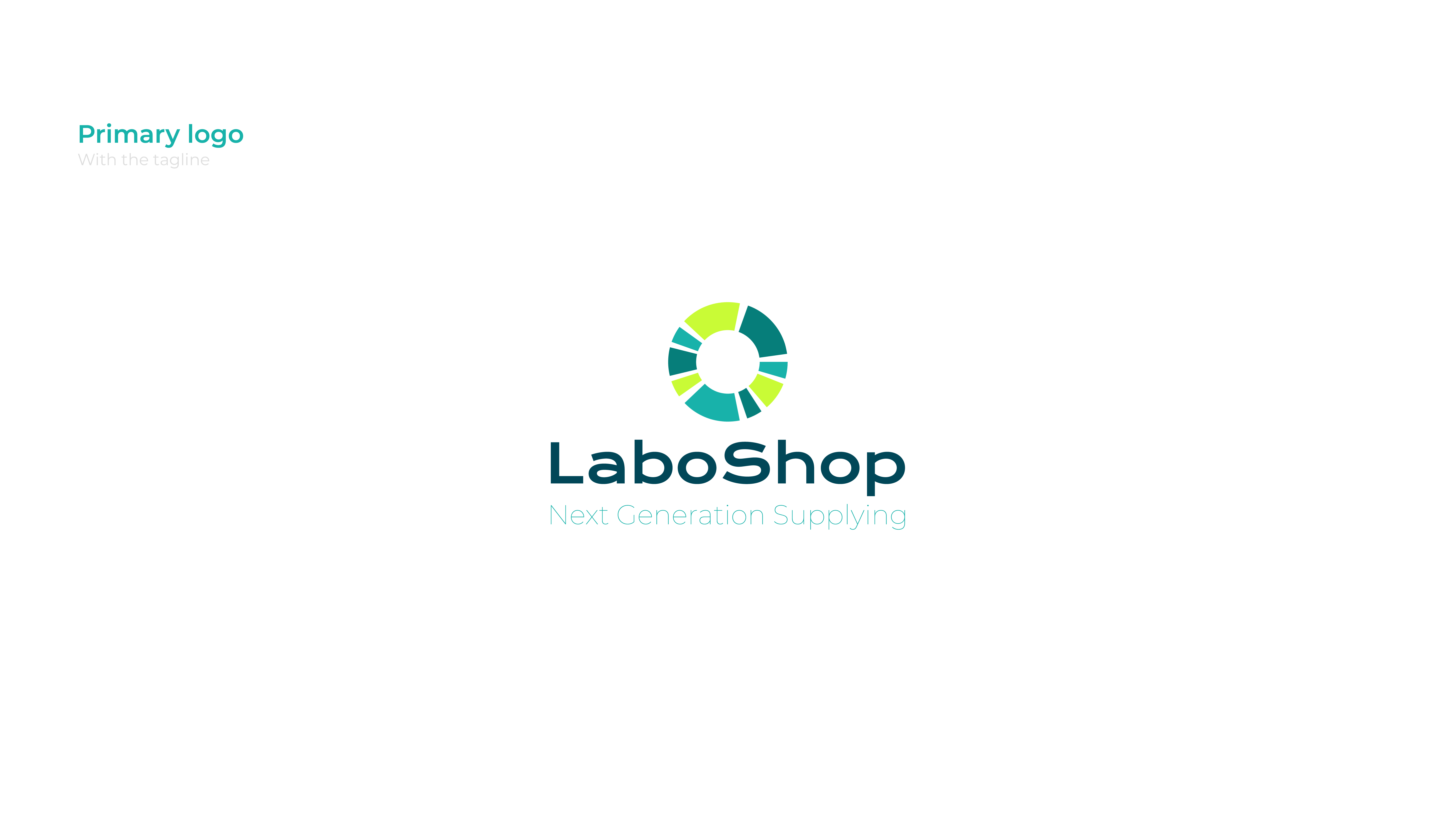
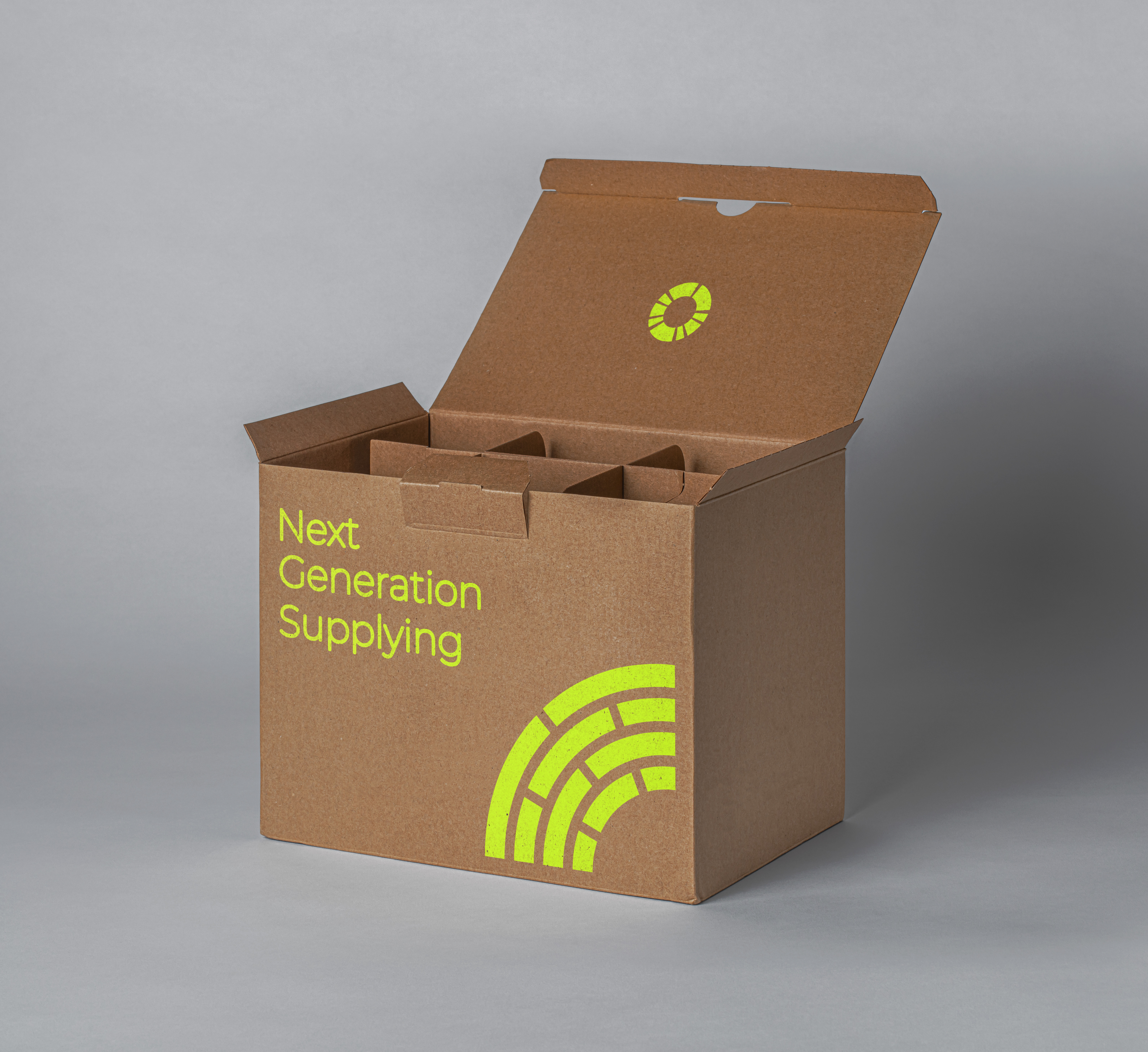
LaboShop is a platform in MENA for everything related to science and laboratory technologies and advances including products, premium services, and news. the online presence is backed by on-ground offices that strategically cover MENA region headquartered in Dubai, the tech CenterPoint of the region.
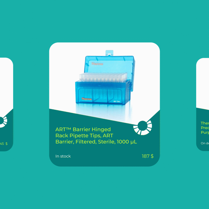
LaboShop is the only store in the MENA region for hundreds of ready-to-deliver, brand-new, refurbished products sour, that's why we gave him special care.
Challenges
After determining the direction of the parent company’s identity "MEMBS" The main challenge here was creating a link between LaboShop's identity & the main identity while maintaining independence and distinction from one another.
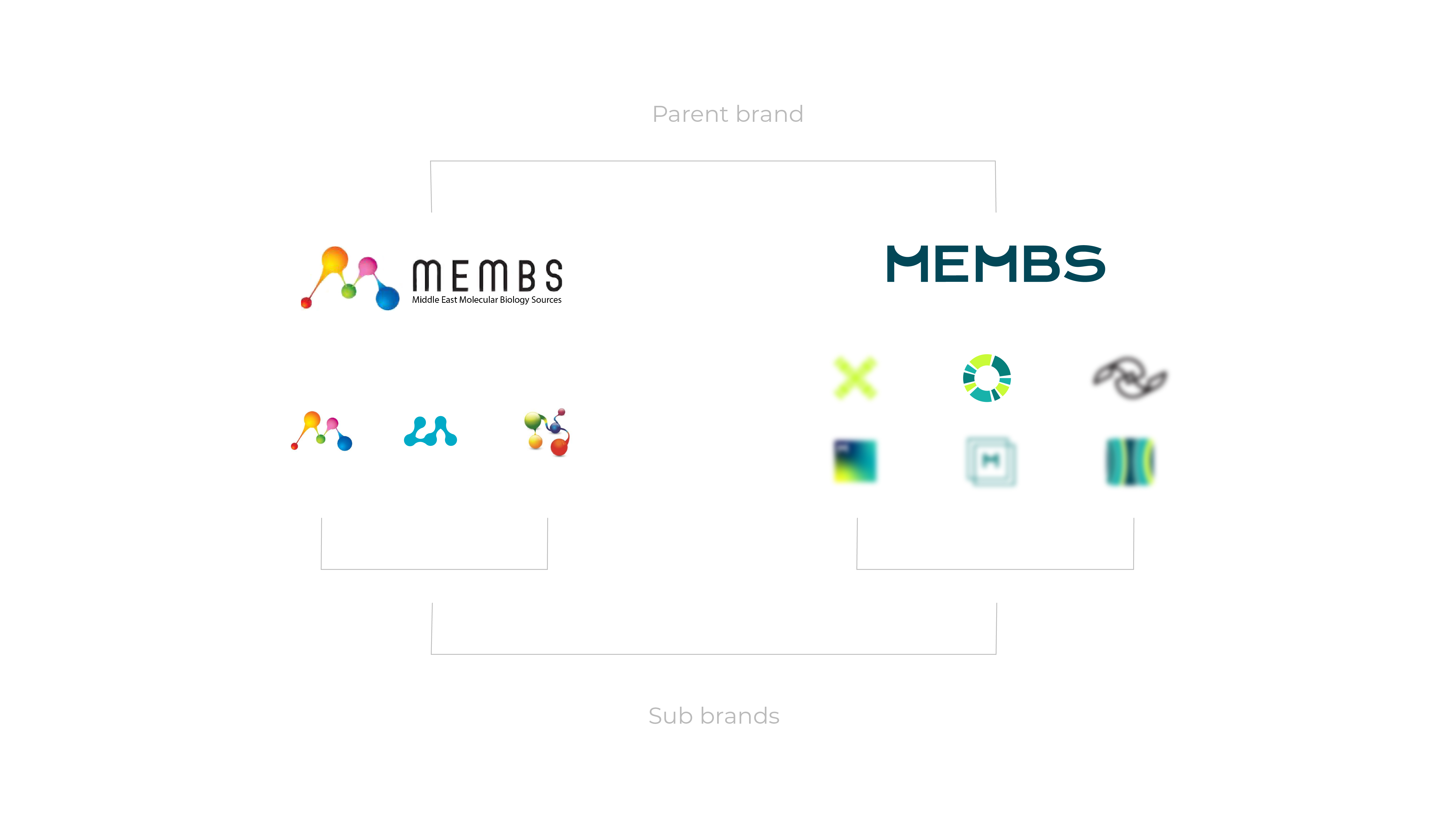
Also achieving independence and distinction for the brand in itself is required, and it will be a way to link the brand with the Parent brand for those who will get to know MEMBS through LaboShop. Which was not exist in the previous identity.
Solutions
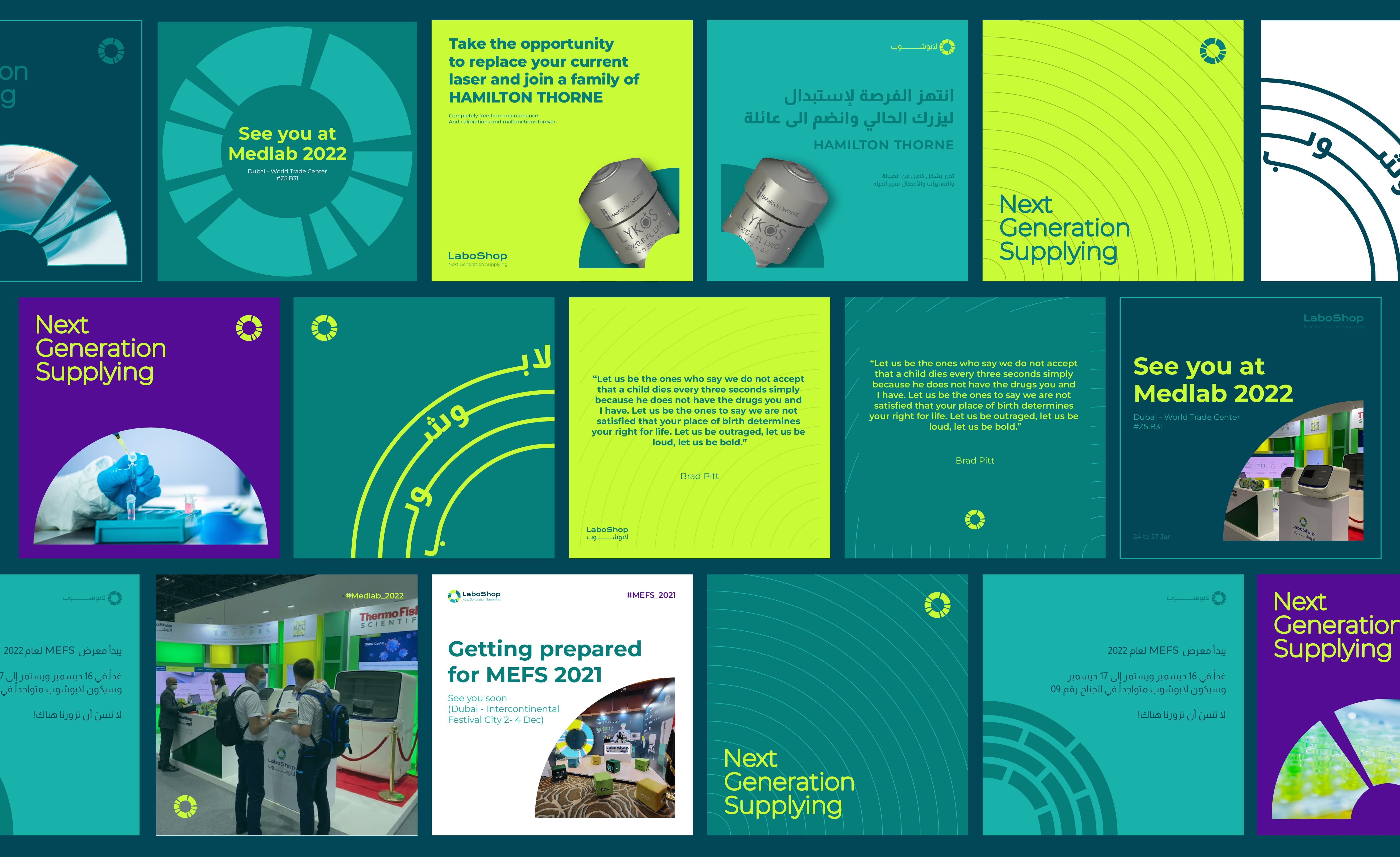
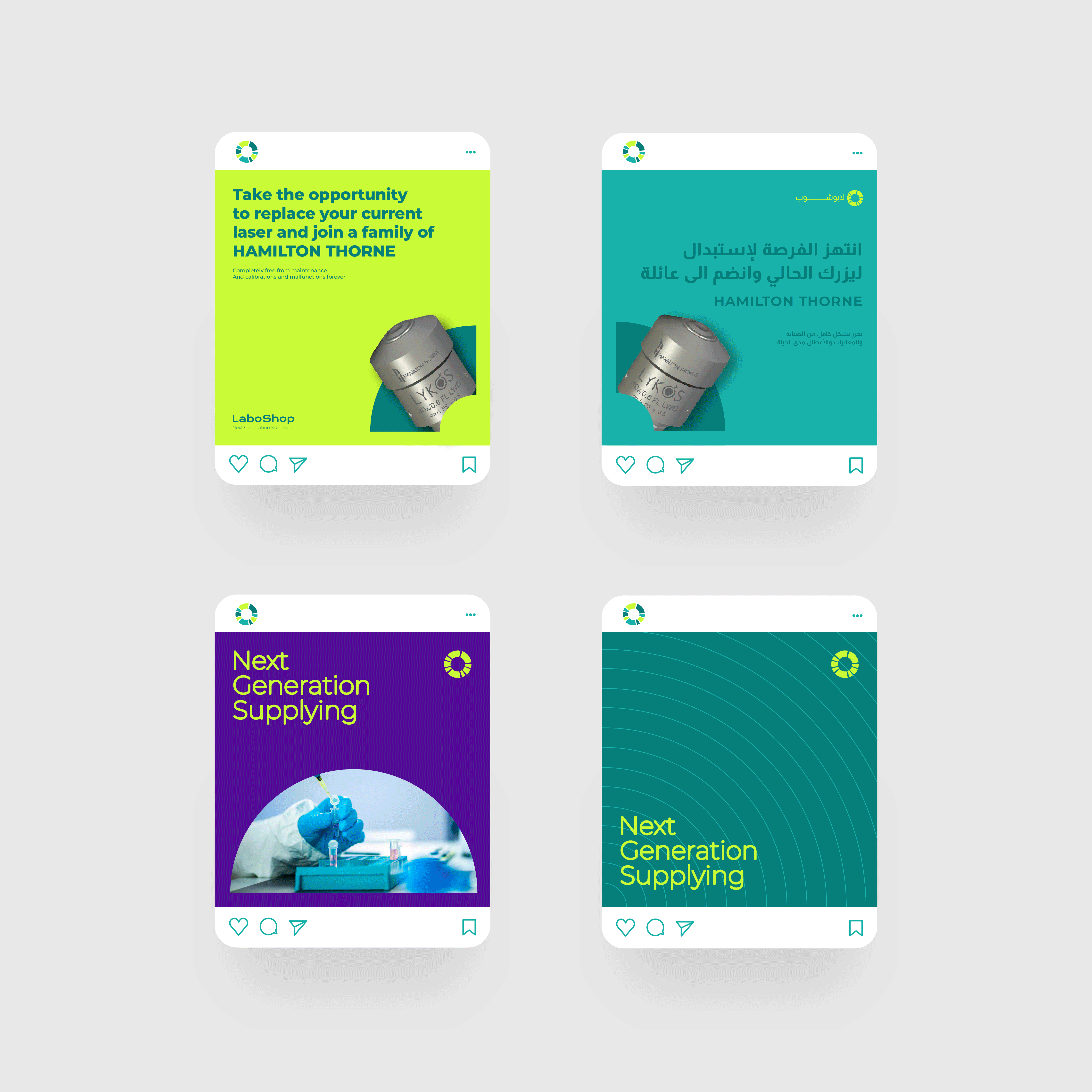
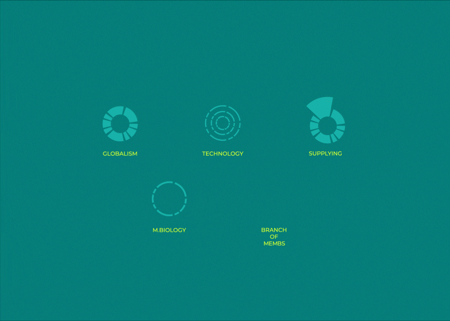
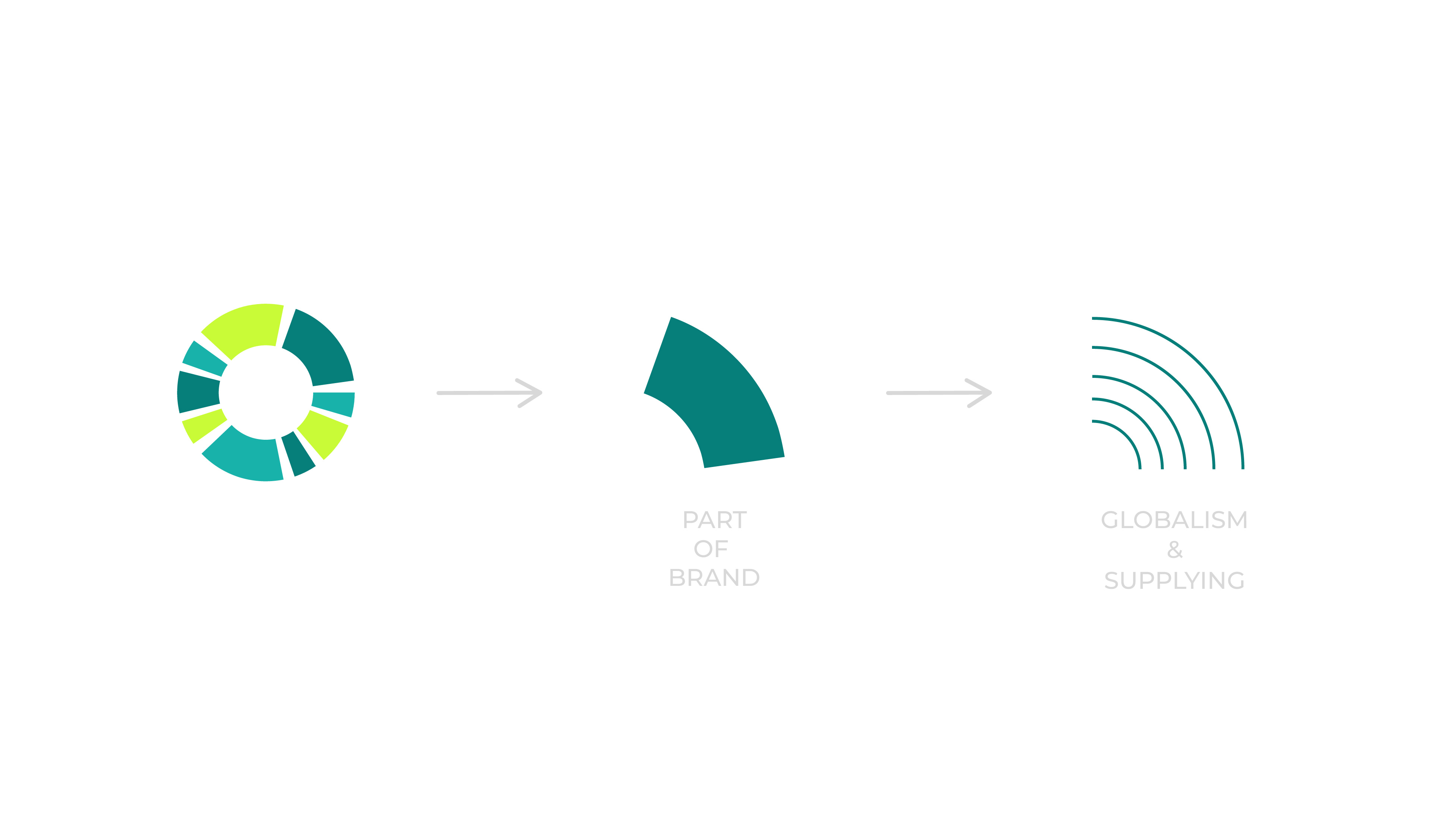
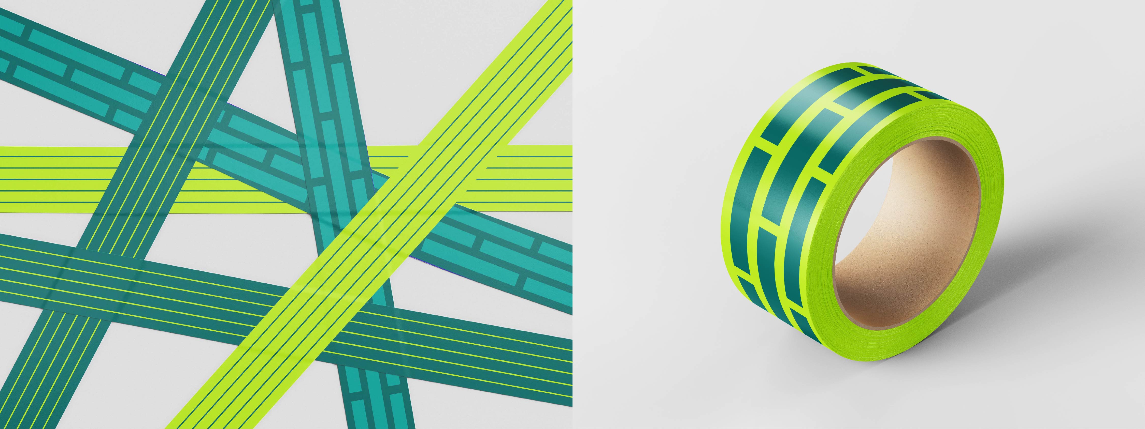
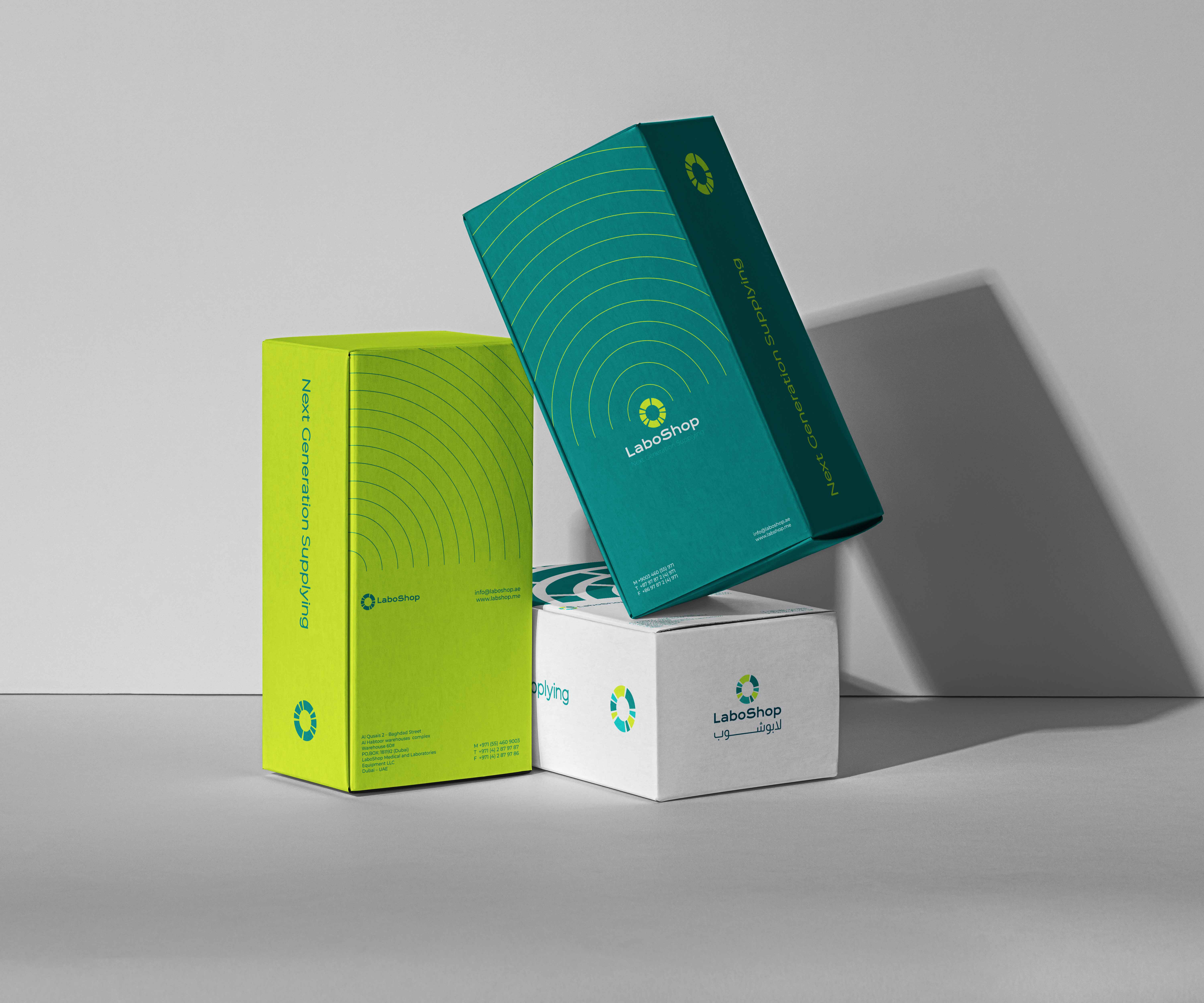
After we came up with ideas from the core of molecular biology and applied it to the identity of the parent company, we decided to search in another direction in parallel with biology, given that the project is commercial. We found one key idea that we can say is the link between the two fields: the circle!
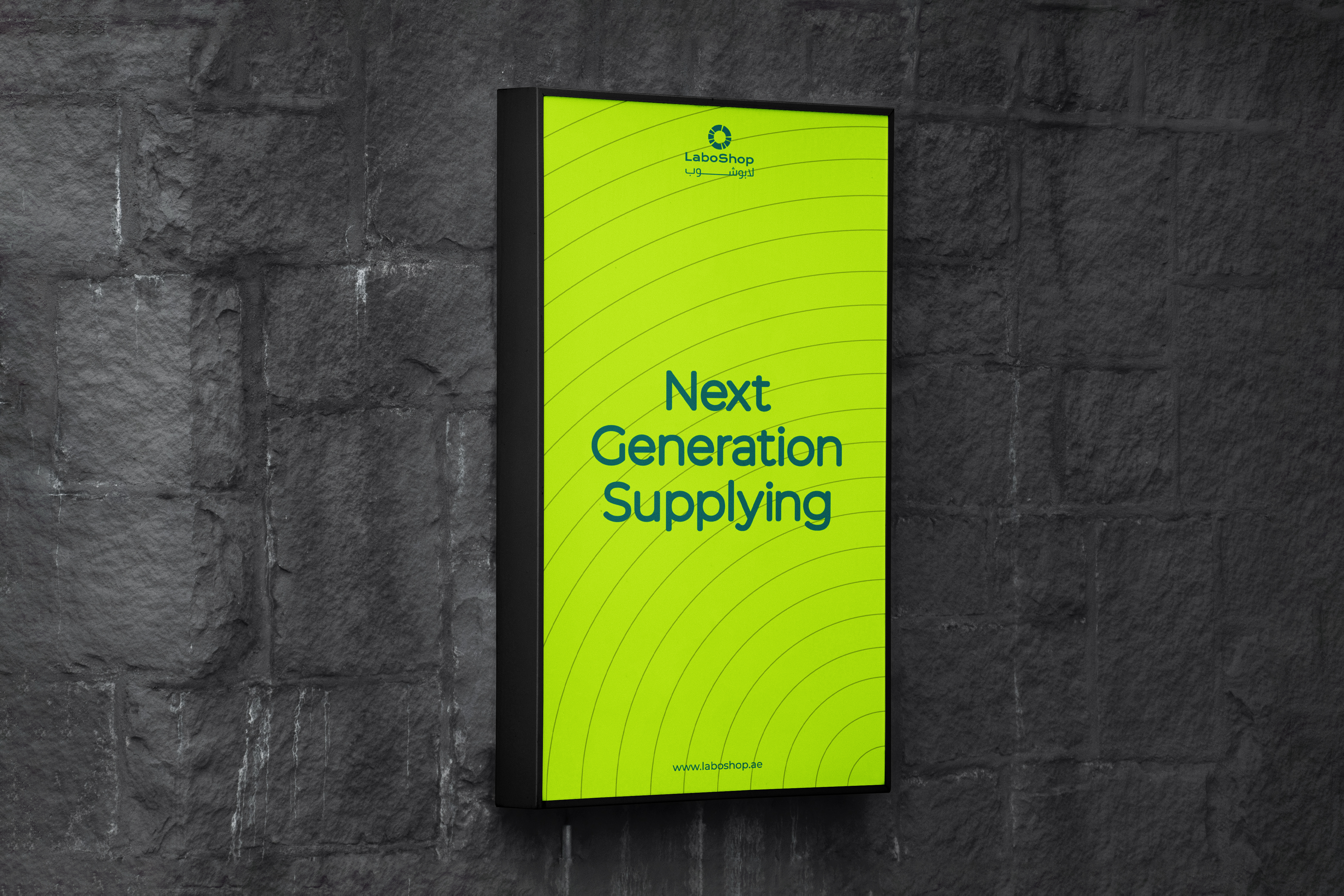
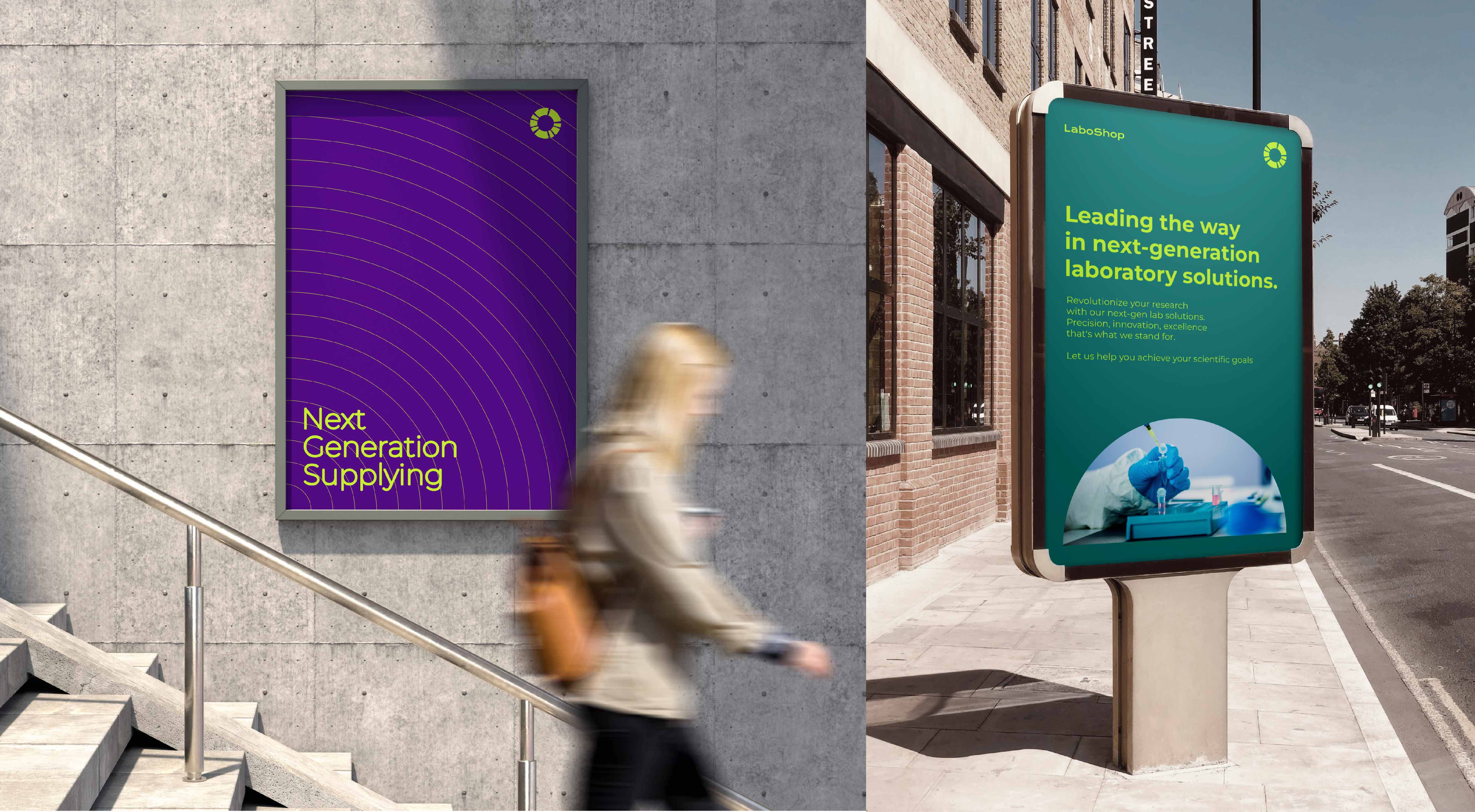
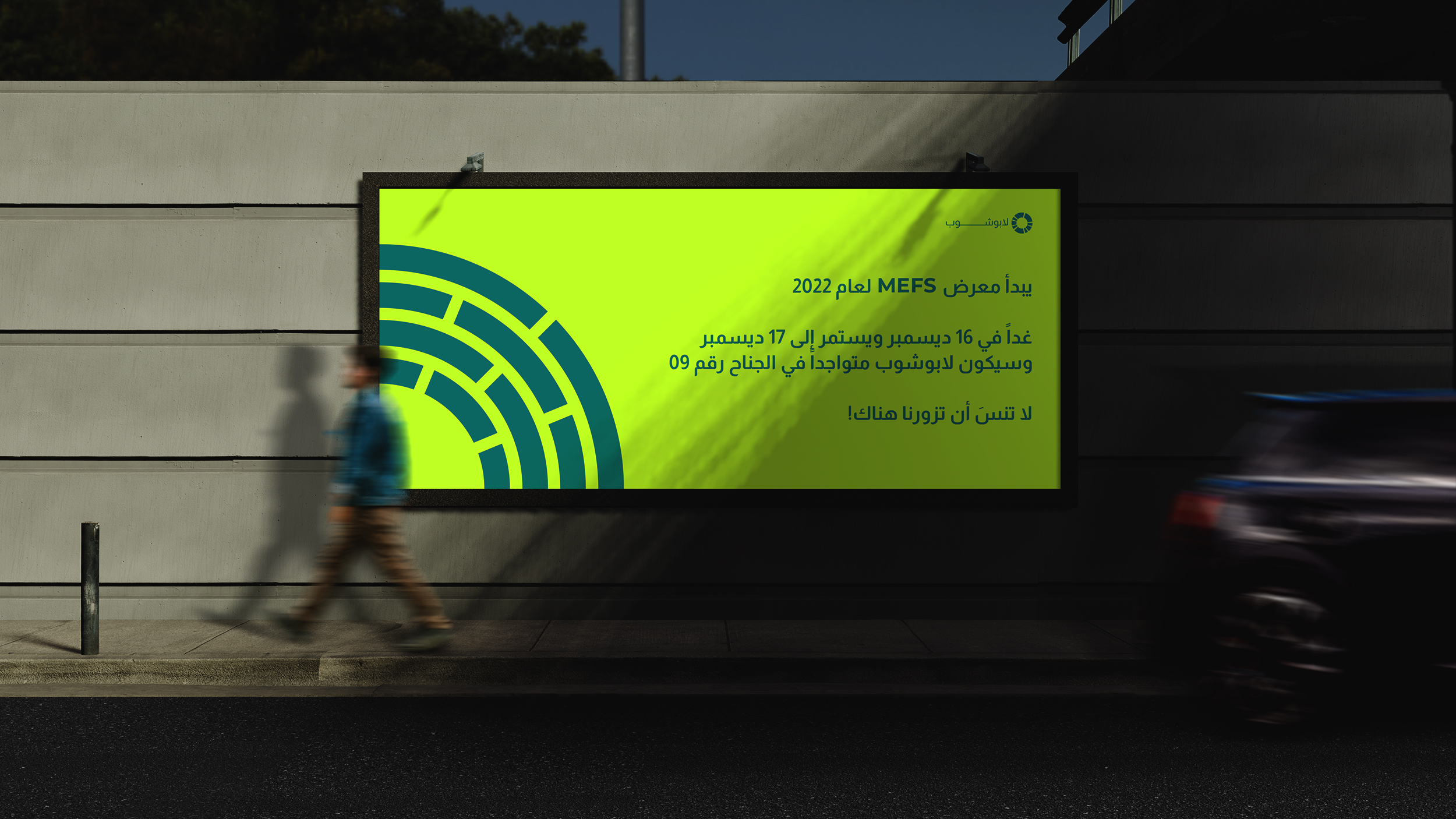
The economic cycle, supply and demand, global, the shape of small objects is circular, most equipment has a circular shape, the cycle of life!... So we decided to rely mainly on the circle and employ it to create a strong, flexible and infinite identity system.
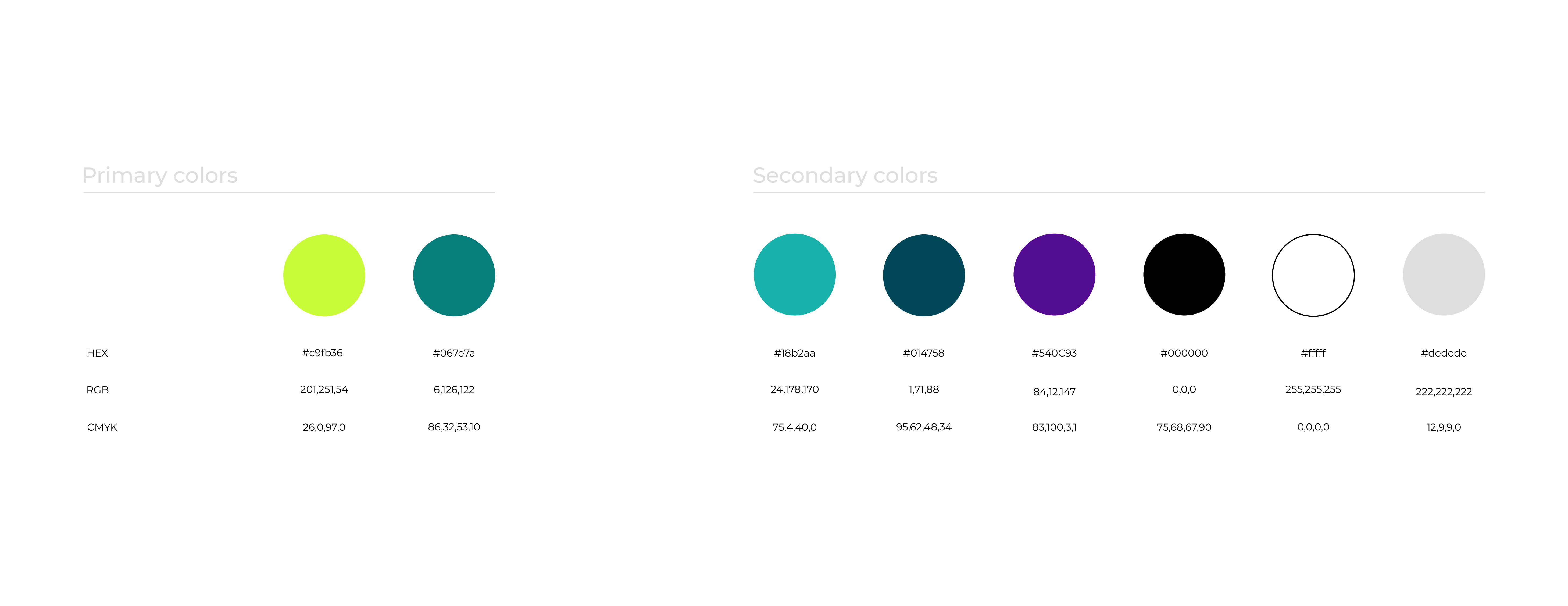
We used the MEMBS identity color palette, which involves selecting two colors as primary colors and using the remaining colors as secondary. While the violet color may not be traditionally associated with the palette, we deliberately incorporated it to achieve a harmonious balance with the other secondary colors. In addition, this decision emphasizes this sub-brands independence and distinctiveness.
The pattern is inspired by the concept of "circle". the pattern has been crafted to serve as a versatile foundation for a wide range of shapes and designs. This attribute is especially crucial for e-commerce brands, as they rely heavily on eye-catching advertising designs to capture the attention of potential customers. By incorporating this pattern into their designs, we can ensure that their creative ideas remain fresh and infinite.
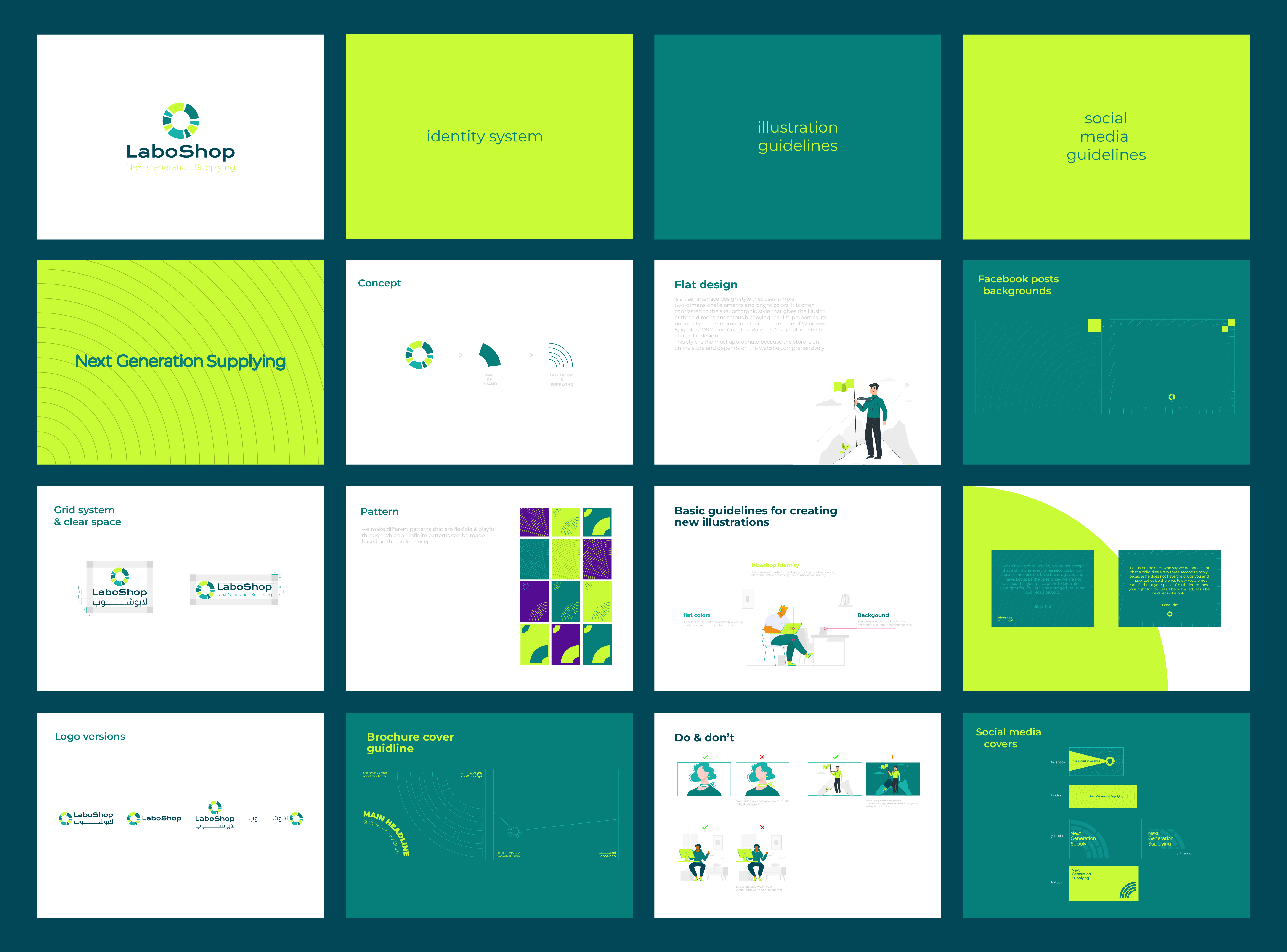

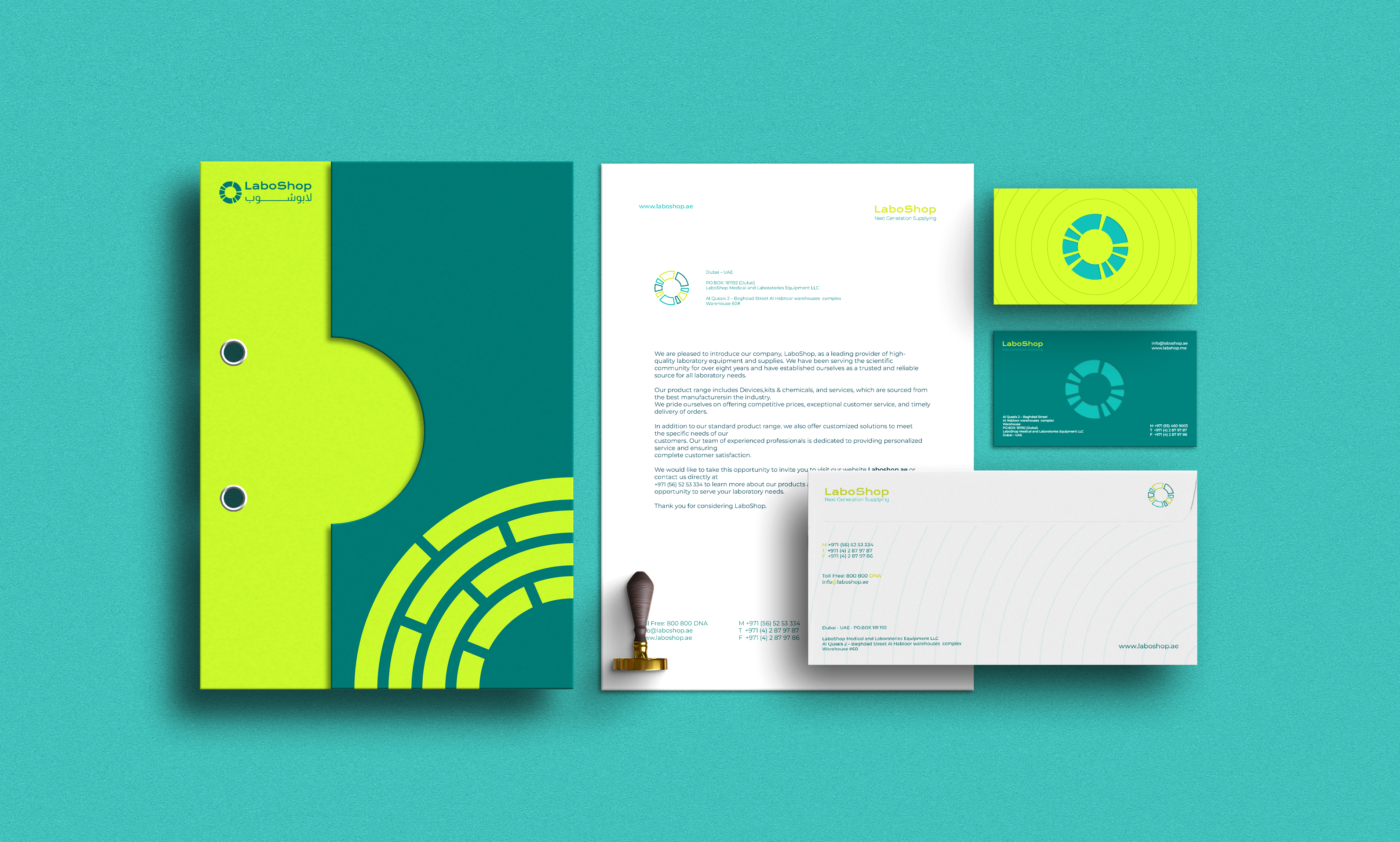
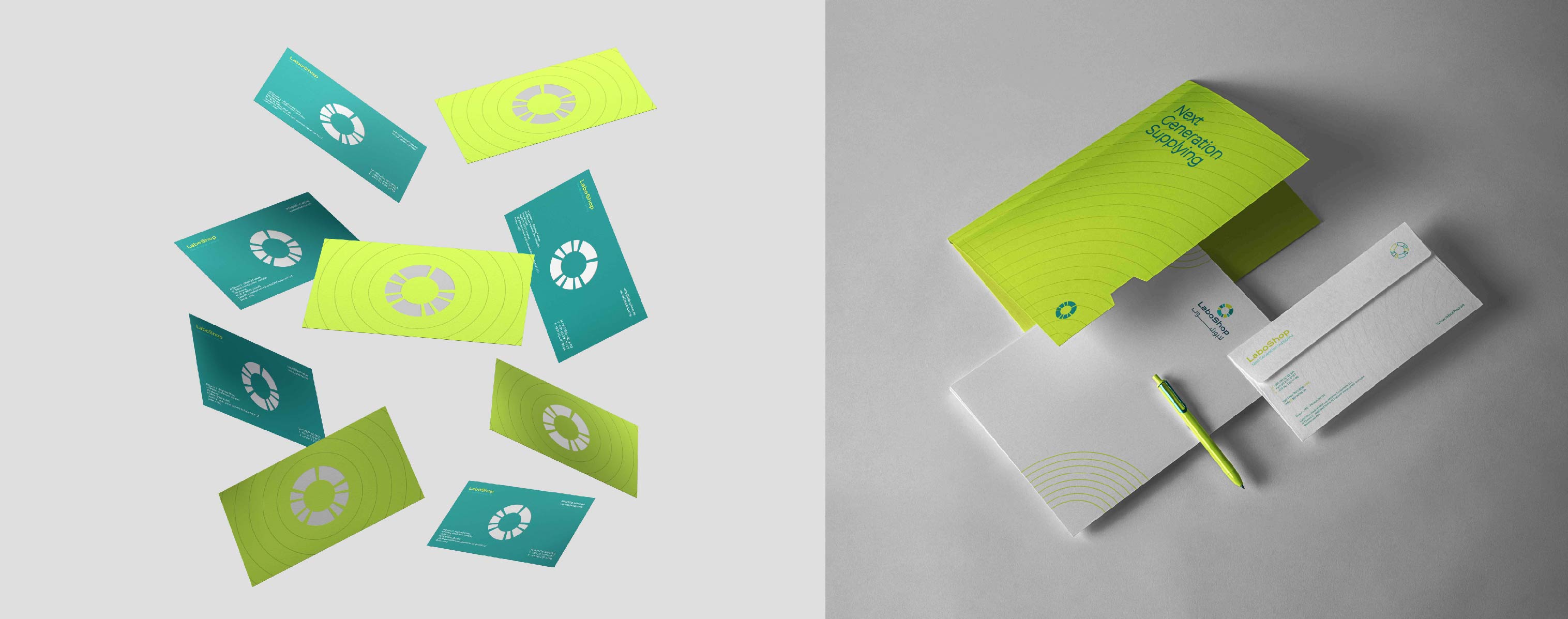
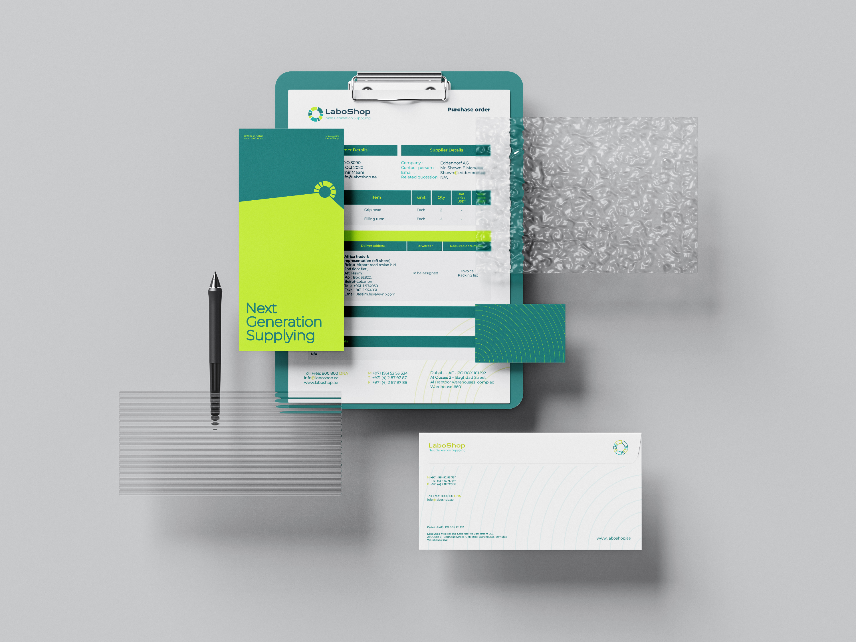
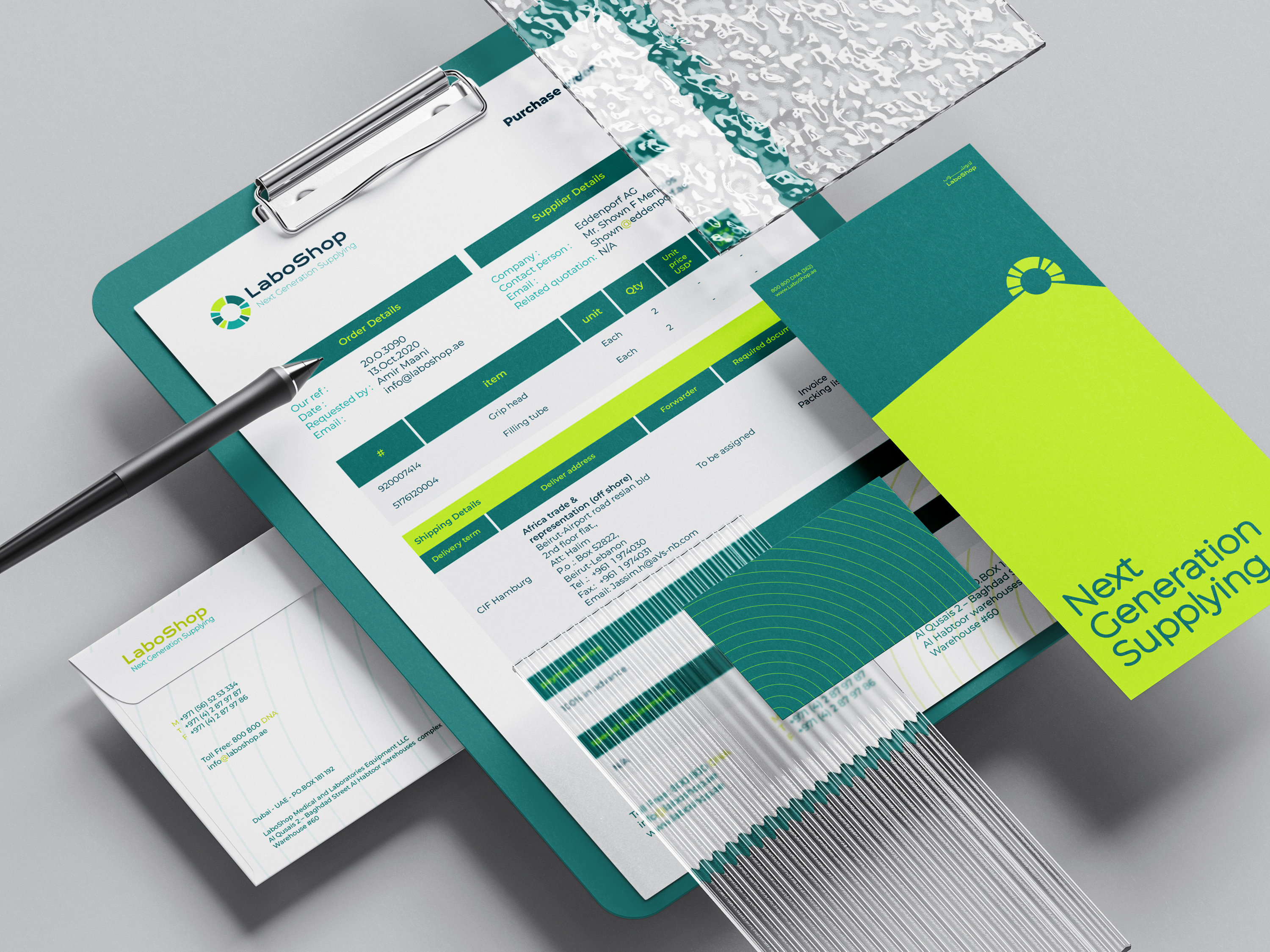
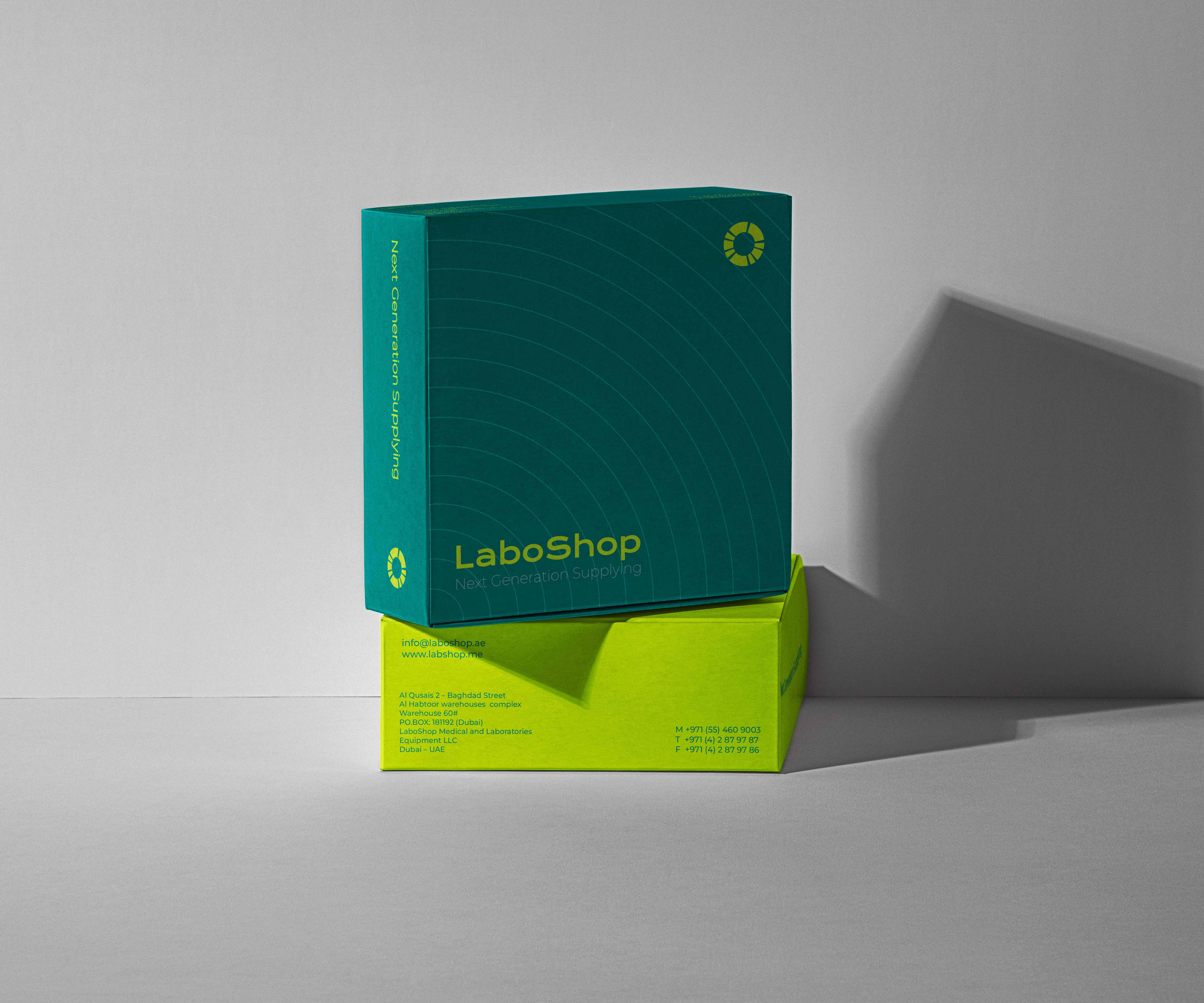
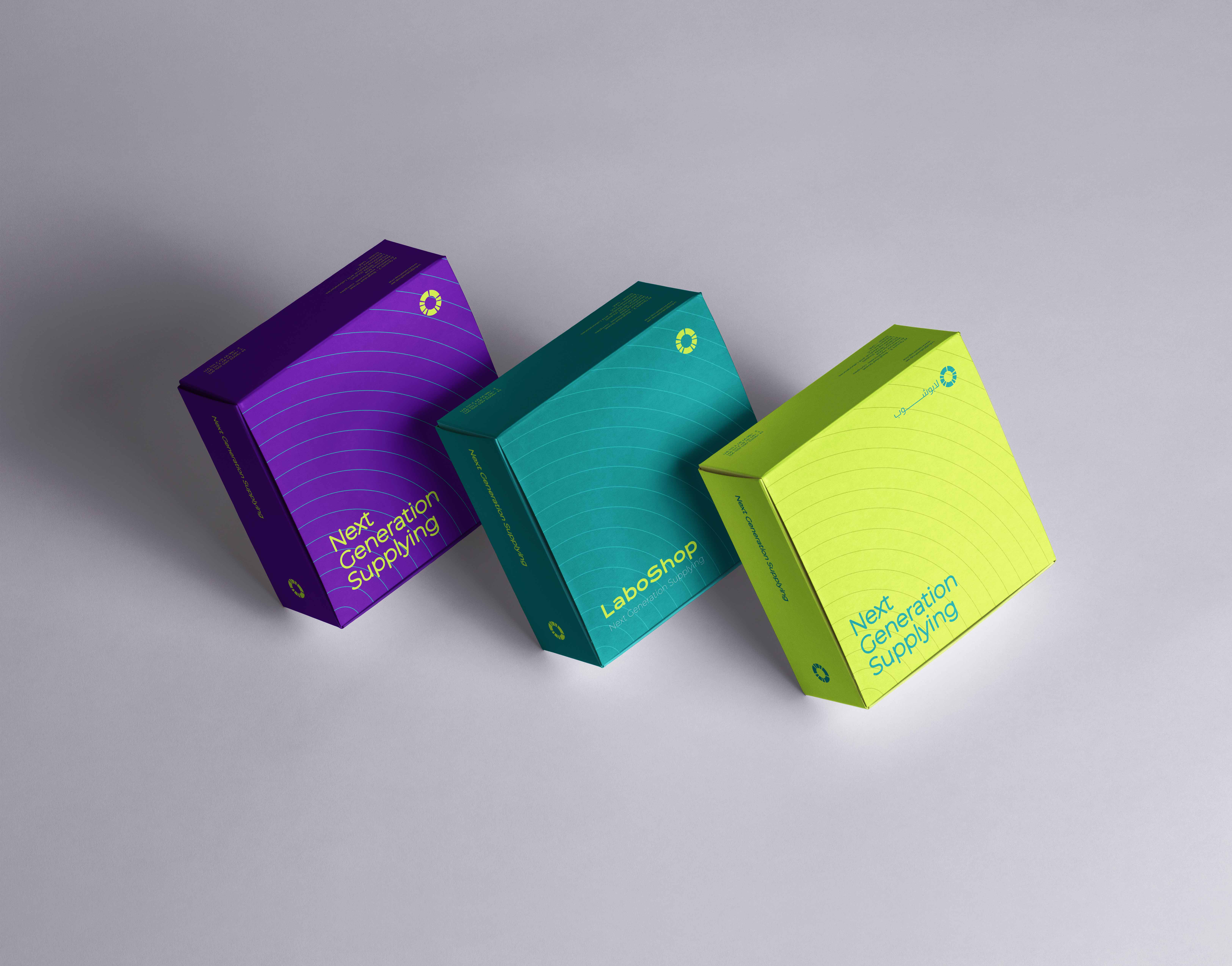
To ensure that the brand's design could flourish in both physical and digital environments, we concentrated on developing a unified and versatile visual system that could be effortlessly modified to suit different media and contexts. This involved creating a consistent color palette and typography, as well as designing a range of graphics and elements that could be utilized across diverse platforms and applications. By doing so, we were able to establish a powerful and distinct visual identity that customers could easily associate with the brand, regardless of where and how they encounter it.